The Great Beyond Brewing Co is a new independent brewery in Hoxton, East London. Founded by three beer loving friends and experienced brewers, Ollie, Nick and John, they take pride in making all their beers vegan, with locally and ethically sourced ingredients.
Designing beer labels
John (one of the founders) contacted me about creating a few labels for Great Beyond. Knowing we share the same passion for sustainability and creativity, I was excited to hear what he had in mind. We had an initial meeting to discuss their current needs, and decided on two different beers that I would design labels for.
The beer can be found at their taproom: 417 Union Walk, London, E2 8HP, as well as at Craft Beer Co., and other selected pubs across London.
The beer can be found at their taproom: 417 Union Walk, London, E2 8HP, as well as at Craft Beer Co., and other selected pubs across London.
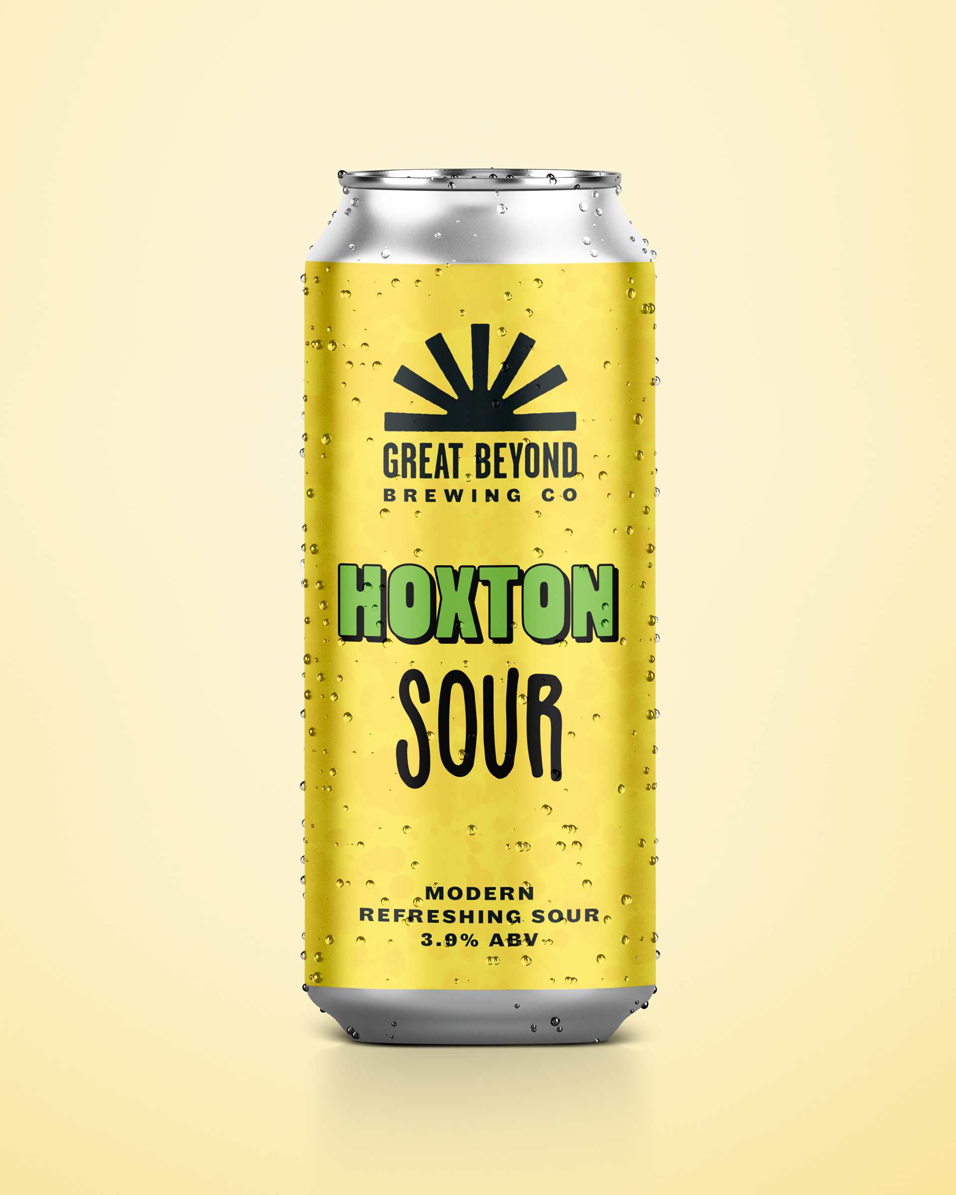
Hoxton Sour
A modern refreshing sour.
"Notes of grapefruit, lemon, black pepper and funk. An elegant interplay of hops and acidity in this sessionable sour."
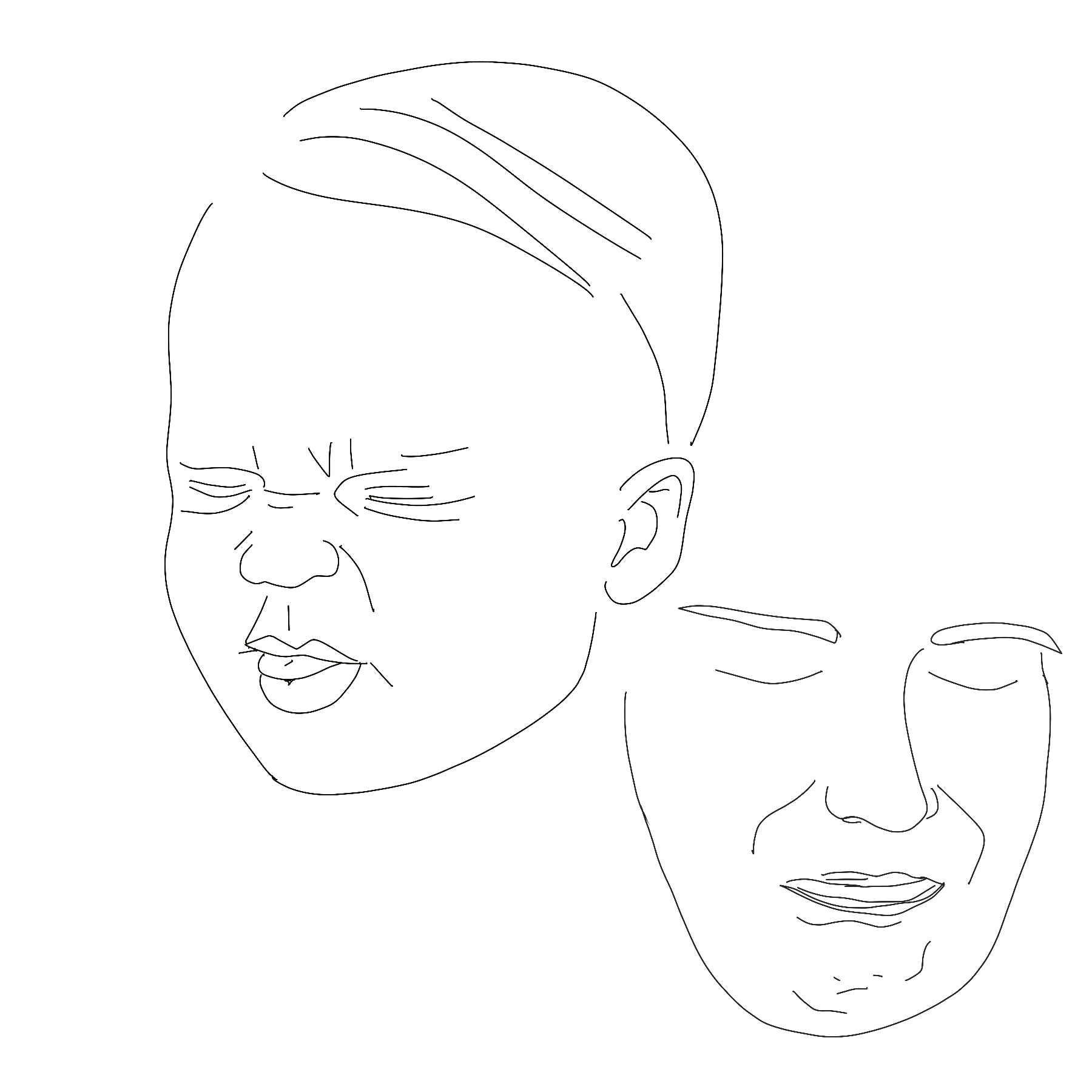
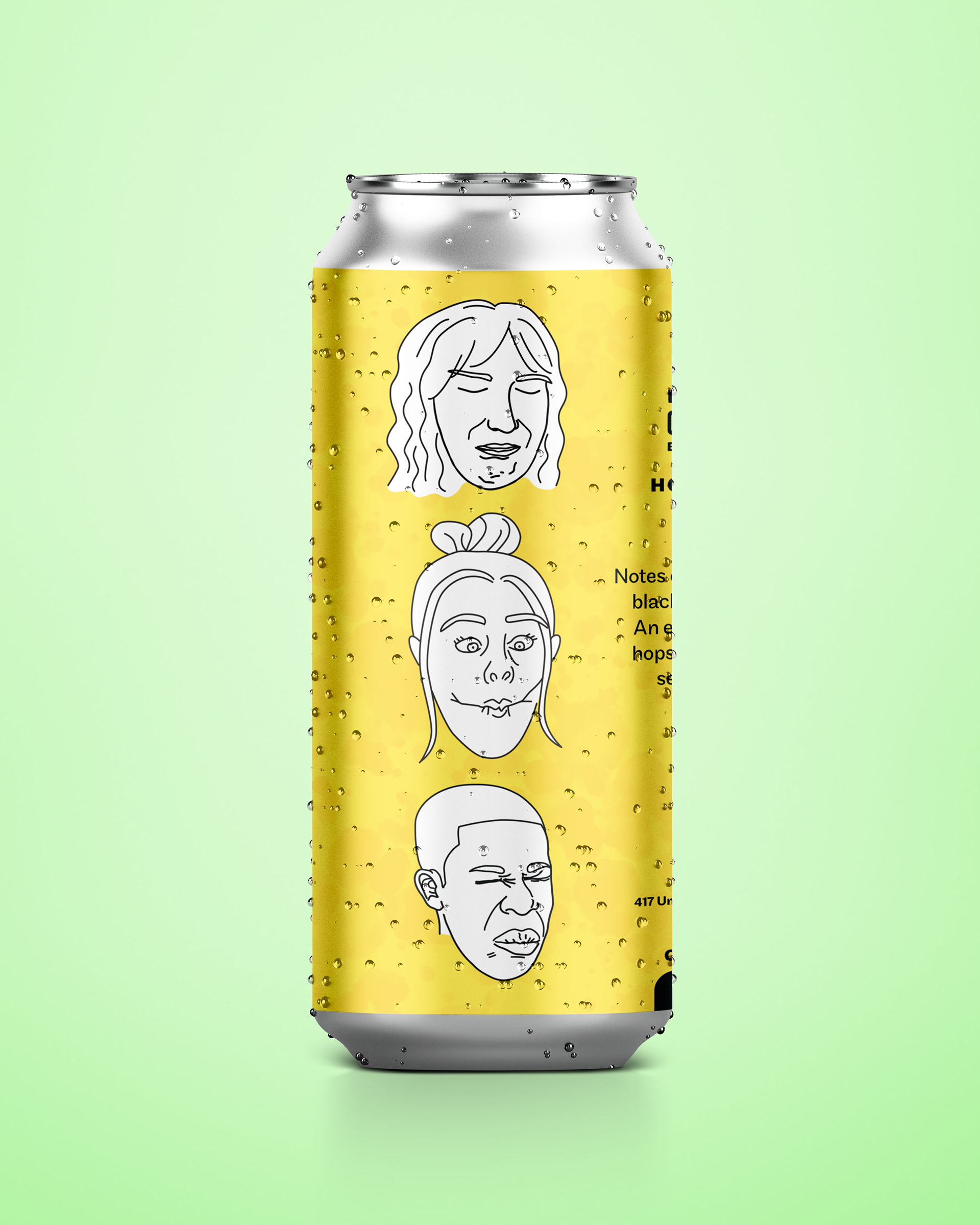
Working with illustrations of facial expressions, I wanted to create a playful approach to designing the label for this sour beer. I drew inspiration from comic books, with vibrant colors and playful handlettered typography. Drawings of people making sour faces was a fun addition, playing on the face someone makes when tasting something sour. The background was kept in line with the other beers in the "Hoxton series" by adding a water color-like texture.
What's the face you make when you taste something sour?

Merch
Sui Generis
Meaning "one of its own", Sui Generis is a hazy pale with lots of character.
Described as a "uniquely balanced refreshing take on a hazy pale.
Bright notes of pineapple, mango and grapefruit."
This immediately connoted bright pastels, and futuristic typography.
The label also draws inspiration from its name—how we are unique
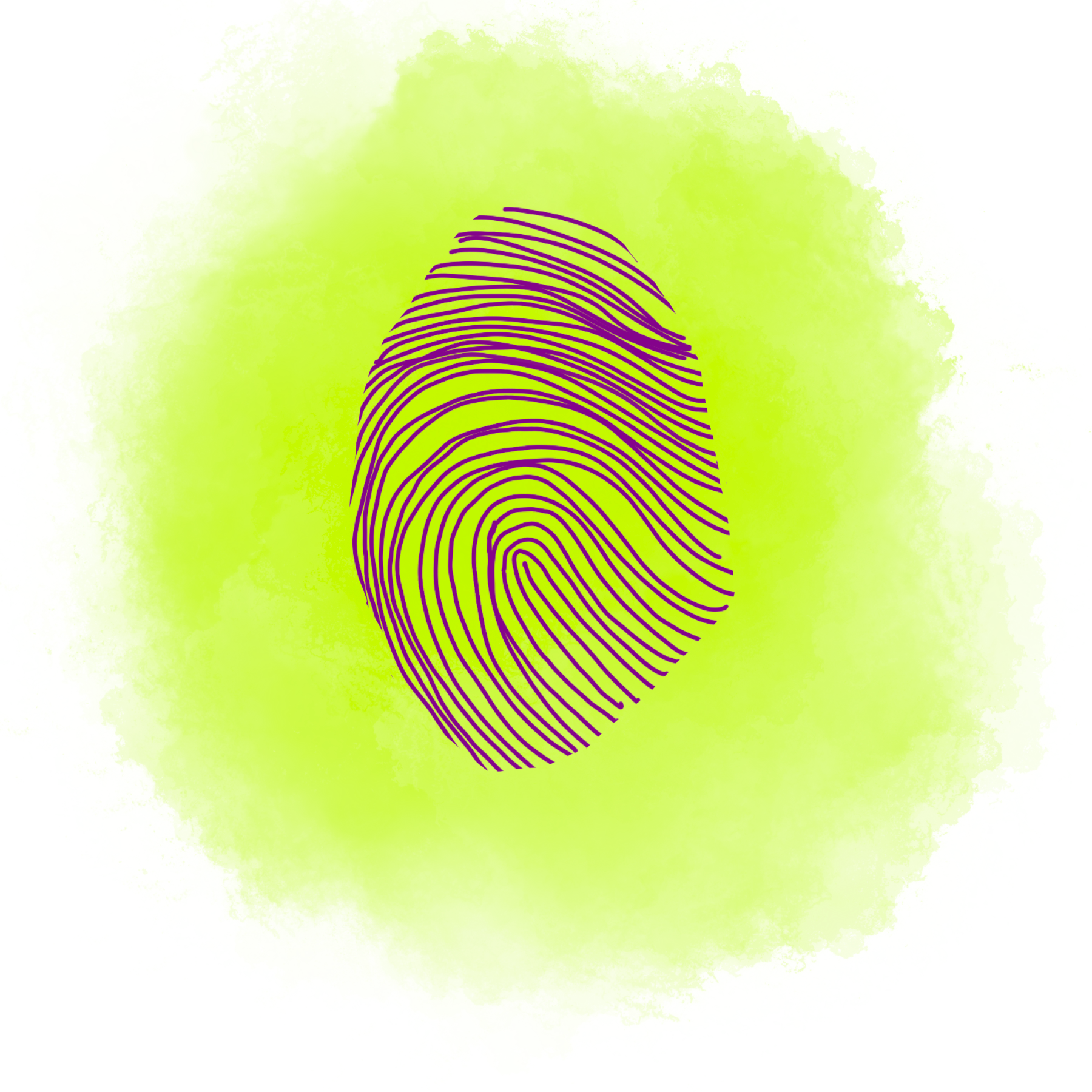
as humans, with an illustrated pattern of fingerprints as its main feature.
Initial sketches
I started out with some initial sketches, trying to find the mood and feel for each design.
